Finding Your Font Fit
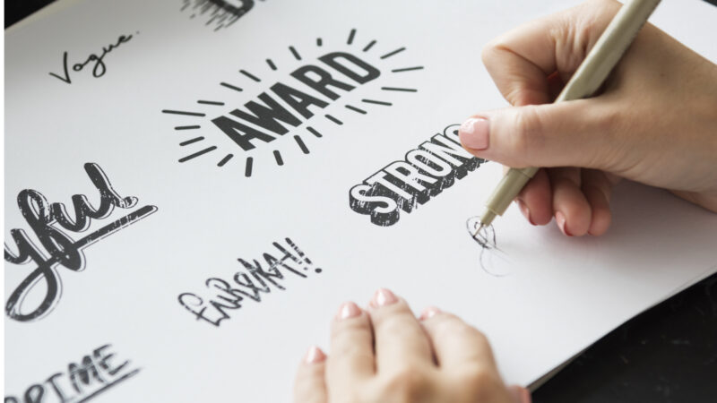 Finding Your Font Fit. Finding the perfect font for your project can be a daunting task. Our guide to selecting the ideal typeface should take some of the legwork out of the job. Whether you’re a designer searching for that eye-catching headline font or a blogger aiming to create a cohesive brand identity, this blog post will walk you through how to find your font fit step-by-step.
Introduction to Typography
Understanding the basics of typography is essential to creating beautiful, effective designs. In this section, we’ll cover the essentials of typography, from choosing a suitable typeface for your project to using fonts effectively. By the end, you’ll have a solid foundation for working with type in your designs.
Understanding Font Families
There are two main groups of fonts: serif and sans serif. Serif fonts have small lines at the end of each letter, while sans-serif fonts do not. Both font types can be used for body copy or headlines, but each has a unique personality.
If you’re looking for a classic, traditional feel, a serif font is your best bet. Serif fonts are often seen as more formal and serious, making them ideal for businesses or organizations that want to convey a sense of trustworthiness and sophistication. However, because they can be seen as stuffy or old-fashioned, serif fonts are not always the best choice for more modern brands.
On the other hand, Sans serif fonts are considered more contemporary and stylish. These fonts are often used by creative businesses or brands that want to communicate a sense of innovation or approachability. Sans serif fonts can also be easier to read on digital screens, making them a good choice for websites or apps.
Choosing the Right Font for Your Project
When choosing the right font for your project, there are a few things you need to keep in mind. First, you need to consider what the project is for. If it’s for something formal, like a business document or report, you’ll want to use a serif font like Times New Roman or Courier. If the project is for something more creative or informal, like a website or flyer, you can use a sans serif font like Arial or Helvetica.
Next, you need to think about the tone of the project. If it’s meant to be serious and professional, you’ll want to use a classic font that is easy to read. If it’s meant to be fun and playful, you can experiment with more unique and interesting fonts.
You need to consider the audience of the project. If it’s for a general audience, you’ll want to use a universally-readable font like Arial or Times New Roman. If it’s for a specific audience, like people with vision impairments, you’ll want to use a larger font or one specifically designed for accessibility.
Keep these factors in mind when choosing a font for your next project!
How to Mix and Match Typefaces
When mixing and matching typefaces, there are a few things you need to keep in mind. First, you want to ensure the typefaces you select have enough contrast. You don’t want two typefaces that are too similar, as this can make your text difficult to read. Second, you’ll want to consider the overall message you’re trying to communicate with your chosen typefaces. Are you going for a playful look? A more serious tone? Once you’ve considered these factors, picking the right typefaces for your project will be a breeze!

Mehaniq
Aesthetics and Legibility: Balancing the Two
Aesthetics and legibility are two crucial factors to consider when choosing a typeface for your project. While you may be drawn to a particular font because it looks good, ensuring it is legible is essential. Here are some tips for finding the right balance between aesthetics and legibility:
– Consider the purpose of your project. If you’re creating something that will be read by many people, such as a website or document, then legibility should be your top priority. On the other hand, aesthetics may be more important if you’re creating something for yourself or a small group of people.
– Look at the different options available. There are many great fonts out there, so take some time to look at all your options before deciding.
– Test out different fonts. Once you’ve narrowed down your choices, try out each font in your project to see how it looks and feels to help you decide which one is right for your project.
What Are Some Popular Fonts?
There are a few key things to keep in mind when choosing a font. Firstly, consider the personality of the brand. A fun and playful brand will do well with a more whimsical font, whereas a serious and luxurious brand should steer towards something classic and elegant. Secondly, take into account the readability of the font. Script fonts can be challenging to read, so they’re best used for short bursts of text or headlines. And finally, make sure there’s enough contrast between the foreground and background colours – no one wants to strain their eyes trying to make out your message!
Now that we’ve got that out of the way, here are ten popular fonts to get you started:
1. Helvetica: A timeless sans-serif font that conveys simplicity and modernity.
2. Times New Roman: The go-to serif font for formal documents like resumes and essays.
3. Arial: Another popular sans-serif option that’s clean and easy to read.
4. Georgia: A serif font with an old-fashioned feel – perfect for traditional businesses or brands with a vintage aesthetic.
5. Comic Sans: A casual script font that’s often used in children’s products or marketing materials aimed at younger audiences.
6. Impact: A bold sans-serif font ideal for headlines or short blocks of text that need to grab
seo, search engine optimization.
Conclusion
Selecting the perfect typeface for your project can be daunting, but with this guide, you now have all the essential information you need to make your selection. Fonts are a crucial part of any design project, so it’s essential that you do everything possible to get it right. So, go forth and choose confidently!
Further Reading
Is Your Font Wrong For Your Website?
Need help turning this advice into action?
If you are reviewing your website, marketing or online visibility, we can help you work out what to improve first.
Related articles
 Content
Why the Same Message Needs to Be Told in Different Ways
There is a quiet myth in business that repeating yourself looks unprofessional. We explore why the same message needs to be told in different…
Read article
Content
Why the Same Message Needs to Be Told in Different Ways
There is a quiet myth in business that repeating yourself looks unprofessional. We explore why the same message needs to be told in different…
Read article
 SEO
How to Get Your Website to the Front of the Crowd
Creating a website today without SEO, social media, or any marketing at all is a bit like standing at the back of the O2…
Read article
SEO
How to Get Your Website to the Front of the Crowd
Creating a website today without SEO, social media, or any marketing at all is a bit like standing at the back of the O2…
Read article
 Branding
 by Committee: The Fastest Way to Kill Your Identity
Branding forms the heart and soul of your business, setting you apart from everyone else. In this article, we explore why designing your brand…
Read article
Branding
Branding by Committee: The Fastest Way to Kill Your Identity
Branding forms the heart and soul of your business, setting you apart from everyone else. In this article, we explore why designing your brand…
Read article
 VideoandWeb.com