Is your font wrong for your website?
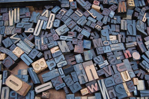
Is your font wrong for your website? Fonts have come a long way from their humble Blackletter beginnings. Their branding power and consumer psychology now afford them a design stage all to themselves.
Many global brands are recognised instantly for their typeface alone. Nike, Asda, Tesco, Sainsbury’s, Google, Ikea, Dyson and Coca-Cola all hang their branding on their font, and all of them invoke an emotional response.

Beware of using too much Comic Sans!
We learn our font associations from as early as six months old. Even before a child can read they will know what Peppa Pig or Disney products look like purely by colour and font. This association permeates our lives on every level.
So, what’s in a font?
So, what’s in a font? It’s a question that Sarah Hyndman discusses in her latest book, Why Fonts Matter. Her research into fonts even goes as far as influencing how a product tastes, simply by how it’s presented in a typeface. Round and red will make food taste sweeter while a jagged font might draw our taste buds to sour or bitter tasting.

Our subconscious does our shopping for us.
Choosing food from the supermarket shelves is a prime example of consumer psychology. We might choose olive oil, ice-cream, wine or yoghurt because the font suggests its Country of origin. It might be produced in this country; however, the font will somehow authenticate it on a subconscious level.
Interestingly, another of Sarah’s study indicates that fonts don’t just have a personality, they have a gender. Results show that women equate the font Bauhaus to a tall, dark and handsome man, while the feminine lines of Didot appealed to men as particularly feminine. Didot is used in the Vogue and Harpers Bizarre brand names, which further illustrates why the font appeared more feminine on a subconscious level.
Get elected with a font!
Barrack Obama used the power of the typeface to great effect in his election campaign. He avoided the traditional and steadfast font option and chose to use Modern Gotham. The typeface evokes feelings of nostalgia, but the omission of serifs makes it appear clean and timeless. Just the kind of emotional response that you would need if your campaign slogan were ‘change.’
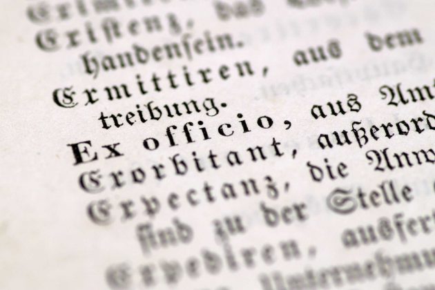
Gothic typeface
Lastly, history and life experience also count when it comes to a font suggestion. One of Sarah’s studies illustrates this by asking people what kind of music they would associate Gothic typefaces with. The older people associated it with Heavy Metal bands such as Iron Maiden, Motorhead or Metallica, while the younger people said that the same typeface is indicative of Hip Hop.
So, before you send out your next flyer, design your website or introduce a new product, think about the hidden meanings that you might be conveying to your customers. Your choice of typeface might just be scaring off your target audience or inciting an emotional response that you might not want.
Need help turning this advice into action?
If you are reviewing your website, marketing or online visibility, we can help you work out what to improve first.
Related articles
 Branding
Designed logo v cheaper outsourced alternative?
A logo is much more than a design. It's your brand's visual identity, the symbol that customers associate with your business. With so much…
Read article
Branding
Designed logo v cheaper outsourced alternative?
A logo is much more than a design. It's your brand's visual identity, the symbol that customers associate with your business. With so much…
Read article
 Branding
What is Digital-First Branding?
Digital-first branding is a strategy that prioritises designing a brand with online platforms as the primary focus. Unlike traditional branding, digital-first branding embraces the…
Read article
Branding
What is Digital-First Branding?
Digital-first branding is a strategy that prioritises designing a brand with online platforms as the primary focus. Unlike traditional branding, digital-first branding embraces the…
Read article
 Branding
Things to Consider When Rebranding
Rebranding represents one of the most thrilling stages in a company's journey, offering a fresh chapter and a unique chance to align its identity…
Read article
Branding
Things to Consider When Rebranding
Rebranding represents one of the most thrilling stages in a company's journey, offering a fresh chapter and a unique chance to align its identity…
Read article
 VideoandWeb.com