Impact Signs Website Case Study
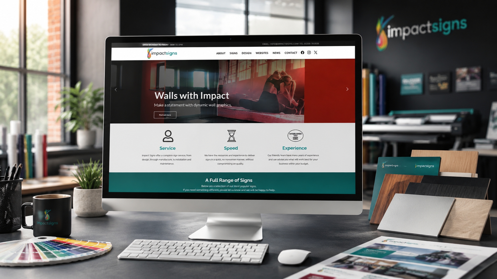
Case study
Impact Signs
- Client
- Impact Signs
- Service
- Website Design
- Project link
- Visit Website
The Brief
Impact Signs needed a website that could properly showcase the range and quality of their work. Their previous site did not make enough of the large archive of project photography they had built up over many years, and it did not give each service enough room to stand on its own.
The main requirement was to create a clear, visually appealing, and easy-to-navigate website that helped potential customers understand what Impact Signs could produce. From shop fronts and vehicle graphics to wall graphics, window graphics, safety signage, banners and illuminated signs, the website needed to show the variety of their work while still making it easy for visitors to find the right service.
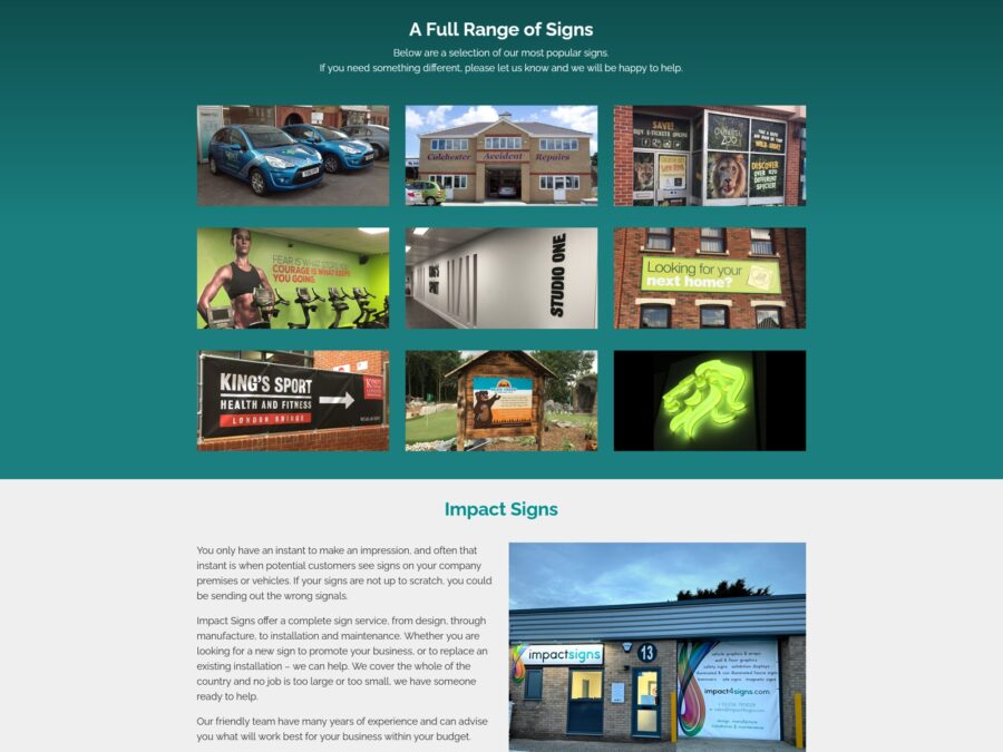
We built Impact Sign's website around its core services
The Challenge
The Impact Signs website did not need to rely on abstract explanations. Impact Signs already had the proof in the form of completed projects. The challenge was to organise the visual material to support the customer journey.
Visitors needed to see relevant examples quickly, without having to search through one large general gallery. Someone interested in wall graphics, for example, needed to see wall graphics. Someone looking for window graphics or safety signage needed examples that matched that specific service.
The site also needed to feel bold and practical, reflecting the nature of the business without becoming cluttered or difficult to use.
The Approach
We built the website around Impact Signs’ core services, creating clear service pages supported by strong project imagery. Each page explained the service in plain language and used real examples to help visitors understand what could be achieved.
A key part of the structure was the use of service-specific galleries at the bottom of relevant pages. These galleries allowed Impact Signs to showcase their work in context, so each service page became both an explanation and a portfolio.
The homepage used a wide hero image slider with graphic text layered over Impact Signs’ own project photography. This feature gave the site immediate visual impact and placed the company’s work at the centre of the design.
We also included a news and project section, giving Impact Signs a way to continue adding examples, advice and completed work over time.
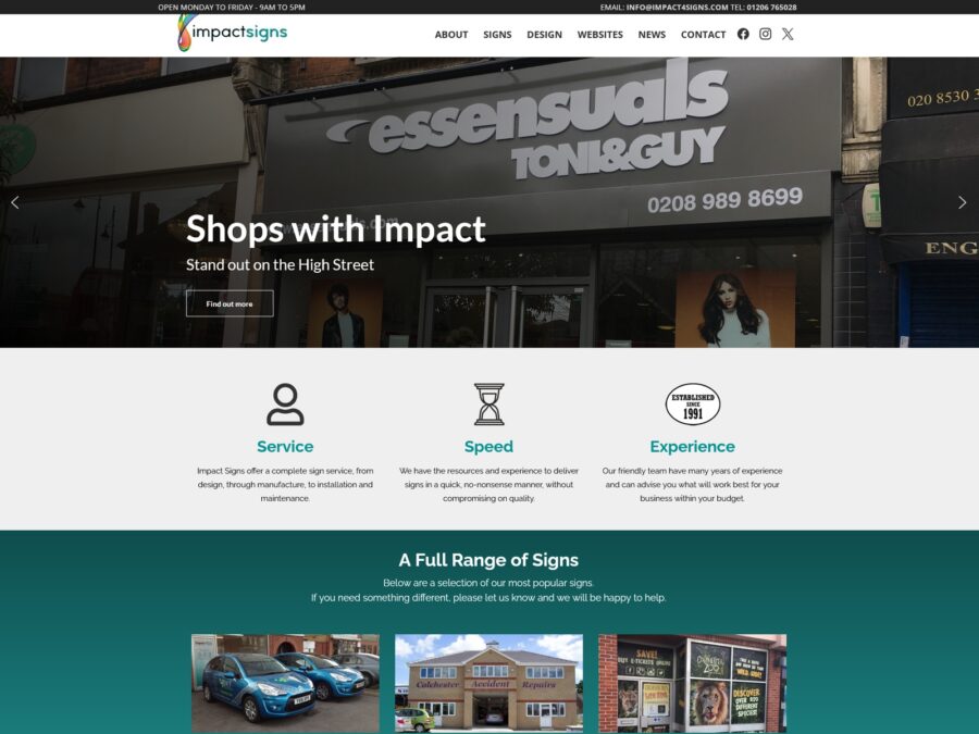
A hero image slider with graphic text gave the site immediate visual impact.
The Result
The finished website gave Impact Signs a much stronger platform for presenting their work. Instead of simply listing services, the site showed what those services looked like in real settings.
The service pages became more useful, the galleries became more relevant, and the homepage created a clear first impression of a business with experience, creativity and practical capability.
The result was a website that works as both a service guide and a growing portfolio, helping potential customers explore ideas, see examples and make an enquiry with confidence.
 VideoandWeb.com