Tips on Rebranding Your Logo
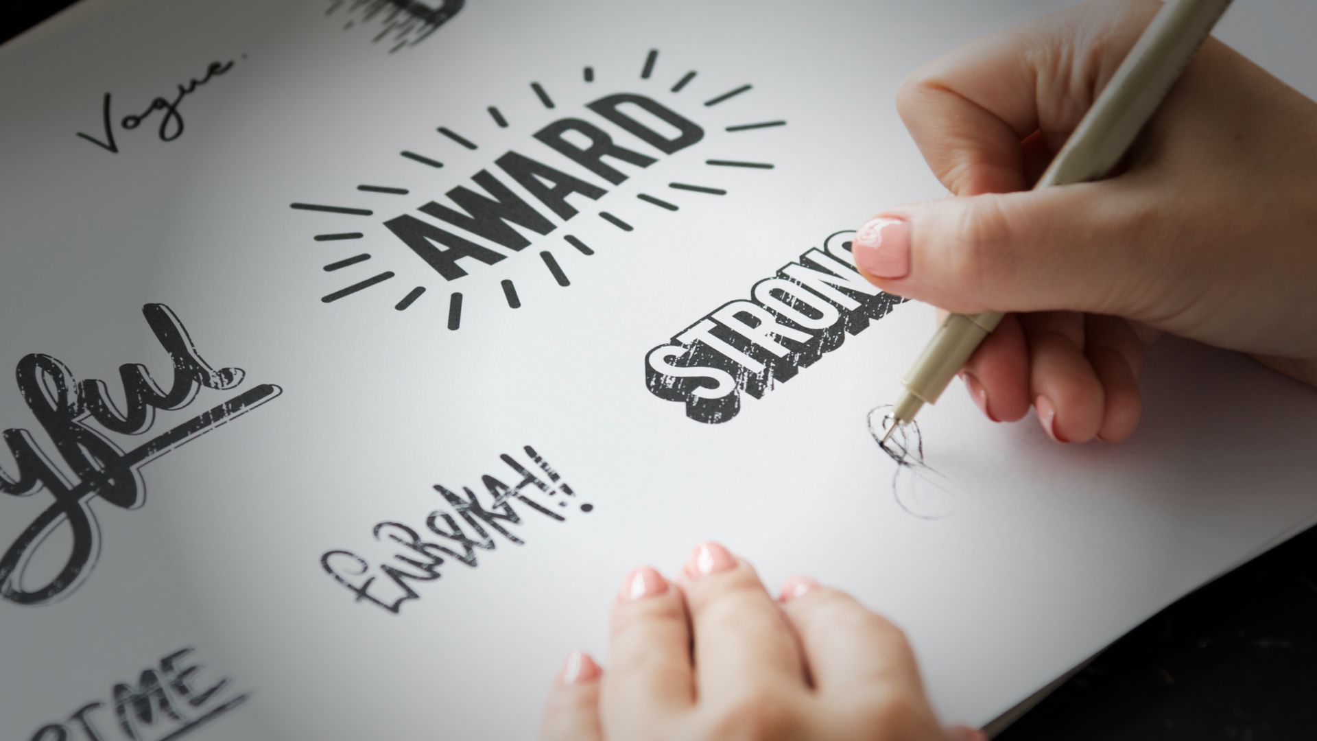 Are you planning to create a new logo for your business or considering rebranding an existing one? A well-designed logo can make a massive impact on the success of your brand. However, creating or revamping a logo is not as simple as it seems.
Businesses make many common mistakes during this process, which can ultimately hurt their brand image and reputation. In this blog post, we’ll discuss some of these mistakes so that you can avoid them and create a logo that truly represents your brand in the best possible way!
What Is a Logo and Why Is It Important?
Your logo is one of the first things potential customers will see when encountering your business. Therefore, making a good impression with a professional, memorable logo accurately representing your company is essential. Here are some common mistakes to avoid when creating or rebranding your logo:
- Don’t use clip art or stock images. Your logo should be unique to your brand.
- Avoid using too many colours or gradients. Instead, stick to a simple colour palette that can be easily reproduced in print and online.
- Don’t make your logo too complicated or busy. A complex design will be difficult to reproduce and won’t stand out as well as a simpler one.
- Be careful with special effects like drop shadows or 3D elements. These can date your logo quickly and make it difficult to read at small sizes.
- Make sure your logo can be used in colour and black and black-and-white. It will often need to be printed on letterhead or other collateral, so it should look just as good in one colour as it does in full colour.
Common Mistakes to Avoid When Designing a Logo
Not doing your research
Before you start designing (or rebranding) your logo, it’s essential to do your research. This means understanding your audience, your competitors’ logos, and what trends are prevalent in your industry. Without this research, creating a logo that resonates with your target audience and sets you apart from the competition will be difficult.
Overcomplicating things
One of the most common mistakes businesses make when designing their logo is overcomplicating things. A logo should be simple and easy to understand; otherwise, it will confuse people. Stick to a few key elements, and don’t try to cram too much into one design.
Using clip art or stock images
If you’re not a professional graphic designer, avoiding using clip art or stock images in your logo is best. These can often look cheap and unprofessional, which is the last thing you want for your brand. Instead, invest in a custom logo design that will really make your business stand out.
Not making it scalable
Your logo needs to be scalable, meaning it should look just as good on a business card as on a billboard. This can be achieved by keeping things simple and avoiding intricate details that will get lost when scaled down. If you’re unsure if your logo is scalable, ask a professional graphic designer for their opinion.
 Tips for Designing the Perfect Logo
- Keep it simple – The best logos are usually the simplest. A complex logo can be challenging to remember and may turn potential customers away.
- Make it memorable – A good logo should be easy to remember so potential customers can easily recall your brand when needed.
- Use strong colours – Use colours that will pop and stand out from the rest. However, avoid using too many colours, which can make your logo appear busy and cluttered.
- Choose the right font – The font you use for your logo should be easy to read and reflect your brand’s overall tone.
- Avoid trends – Trends come and go, but a good logo should be timeless. So stick to classic design principles that will make your logo look just as good ten years from now as it does today.
The Benefits of Rebranding Your Logo
There are many benefits to rebranding your logo. A well-designed logo can help you communicate your brand’s message more effectively, connect with your target audience, and build customer loyalty. Additionally, a fresh logo can boost your business, helping you stand out from the competition.
Rebranding your logo can be an extremely effective marketing tool when done correctly.
How to Choose the Right Color Scheme for Your Logo
When creating or rebranding your logo, one of the most common mistakes is choosing the wrong colour scheme. The colours you choose for your logo can say a lot about your brand, so it’s important to choose wisely. Here are a few tips on how to choose the right colour scheme for your logo:
- Consider your brand identity. What kind of message do you want to communicate with your colours? For example, if you want to convey a sense of vibrancy and energy, you might want to use brighter colours. On the other hand, if you want to convey a more calming and serene feeling, you might want to use softer colours.
- Consider the different meanings of colours. Different colours can evoke different emotions in people. For example, red is often associated with excitement and energy, while blue is associated with calmness and serenity. Choose the colours that best reflect the feelings you want people to associate with your brand.
- Use contrasting colours. Contrasting colours will help make your logo more eye-catching and memorable. Avoid using similar shades of colour next to each other, as this can make your logo look muddy and unprofessional.
- Limit yourself to 2-3 colours. Using too many colours in your logo can be overwhelming and confusing for people. Instead, stick with 2-3 main colours that complement each other well, and use additional accent colours sparingly.
Different Logos Types and Which Ones Are Best For Your Brand
There are four primary types of logos: wordmarks, lettermarks, pictorial marks, and abstract logos. Each has its benefits and drawbacks that you should consider before settling on a final design.
A wordmark logo is simply your brand’s name in a stylized font. This type of logo is best for companies with strong name recognition, like Coca-Cola or Google. A wordmark can be an effective way to communicate your brand’s personality.
A lettermark logo is similar to a wordmark, but instead of using a whole word, it relies on initials. This type of logo can be especially helpful if your brand name is long or difficult to pronounce. B & Q and HSBC are both examples of companies that use lettermarks.
Pictorial marks use images rather than words to represent a brand. These types of logos work well for companies that want to convey what they do at a glance (think: Apple and its bitten apple icon).
Abstract logos don’t attempt to represent anything literal; instead, they rely on shape, colour, and form to create something unique that will be associated with your company. FedEx and Pinterest are two well-known brands that have used this approach.
The best type of logo for your brand depends on many factors, including the nature of your business and your target audience. You may want to consult with a professional designer to get started.
Conclusion
Creating or rebranding your logo can be daunting, and taking the time to do it right is vital. By avoiding the common mistakes discussed in this article, you will be well on your way to creating an effective and memorable logo for your business. With a little extra effort and attention to detail, you can create a unique logo that stands out from the competition and reflects who you are as a company.
Further Reading
Is your font wrong for your website?
What Is A Colour Palette And Why Should You Care?
Are your branding colours delivering the right message?
Need help turning this advice into action?
If you are reviewing your website, marketing or online visibility, we can help you work out what to improve first.
Related articles
 Branding
Designed logo v cheaper outsourced alternative?
A logo is much more than a design. It's your brand's visual identity, the symbol that customers associate with your business. With so much…
Read article
Branding
Designed logo v cheaper outsourced alternative?
A logo is much more than a design. It's your brand's visual identity, the symbol that customers associate with your business. With so much…
Read article
 Branding
What is Digital-First Branding?
Digital-first branding is a strategy that prioritises designing a brand with online platforms as the primary focus. Unlike traditional branding, digital-first branding embraces the…
Read article
Branding
What is Digital-First Branding?
Digital-first branding is a strategy that prioritises designing a brand with online platforms as the primary focus. Unlike traditional branding, digital-first branding embraces the…
Read article
 Branding
Things to Consider When Rebranding
Rebranding represents one of the most thrilling stages in a company's journey, offering a fresh chapter and a unique chance to align its identity…
Read article
Branding
Things to Consider When Rebranding
Rebranding represents one of the most thrilling stages in a company's journey, offering a fresh chapter and a unique chance to align its identity…
Read article
 VideoandWeb.com