Designing Websites Around Colour
 Here are some tips about designing websites around colour. From calming blues to vibrant yellows, the colours you choose for your website can profoundly impact how users feel and interact with your brand. In this blog post, we’ll explore how harnessing the power of colour in web design can elevate mood, increase engagement, and ultimately drive conversions.
One of the main reasons why colour is so important in website design is its ability to affect our moods and emotions. People are naturally drawn to certain colours based on their preferences and cultural influences. For example, warm colours like reds and oranges elicit excitement and energy, while cooler tones like blues and greens are often associated with calmness and relaxation.
Additionally, specific colours have been shown to have psychological effects on individuals. For instance, yellow is often linked with warmth, happiness, and optimism, while purple can convey luxury or sophistication. By understanding these associations between colours and emotions, website designers can strategically choose the right colour palette for their target audience.
Moreover, colour also plays a significant role in enhancing brand recognition. Consistent use of colour throughout a website can help create a strong visual identity for a brand. It allows users to easily identify your company or product when they come across your brand’s logo or marketing materials elsewhere, online or offline.
Furthermore, using appropriate colours on your website can also improve user engagement. A well-designed site that uses harmonious colours creates an aesthetically pleasing experience for visitors. It makes them more likely to explore the site’s content further instead of leaving immediately due to poor design choices.
The Psychology of Colour: How Colours Affect Mood and Emotions
Understanding the psychology behind colours can help designers create aesthetically pleasing websites and elicit specific emotional responses from users.
It is important to understand that different colours have different meanings and interpretations across cultures. For example, while red may symbolise passion and love in Western cultures, it can represent luck or celebration in Asian cultures. Therefore, when designing a website for a global audience, it is crucial to consider the cultural context of colour choices.
Warm colours like red, orange and yellow tend to evoke feelings of energy, excitement and positivity. These colours are often associated with action and stimulation, which makes them effective for use in call-to-action buttons or highlighting important information on a website. On the other hand, cool colours such as blue, green and purple are known to have a calming effect on individuals. They are often used for websites or brands related to health, wellness or relaxation.
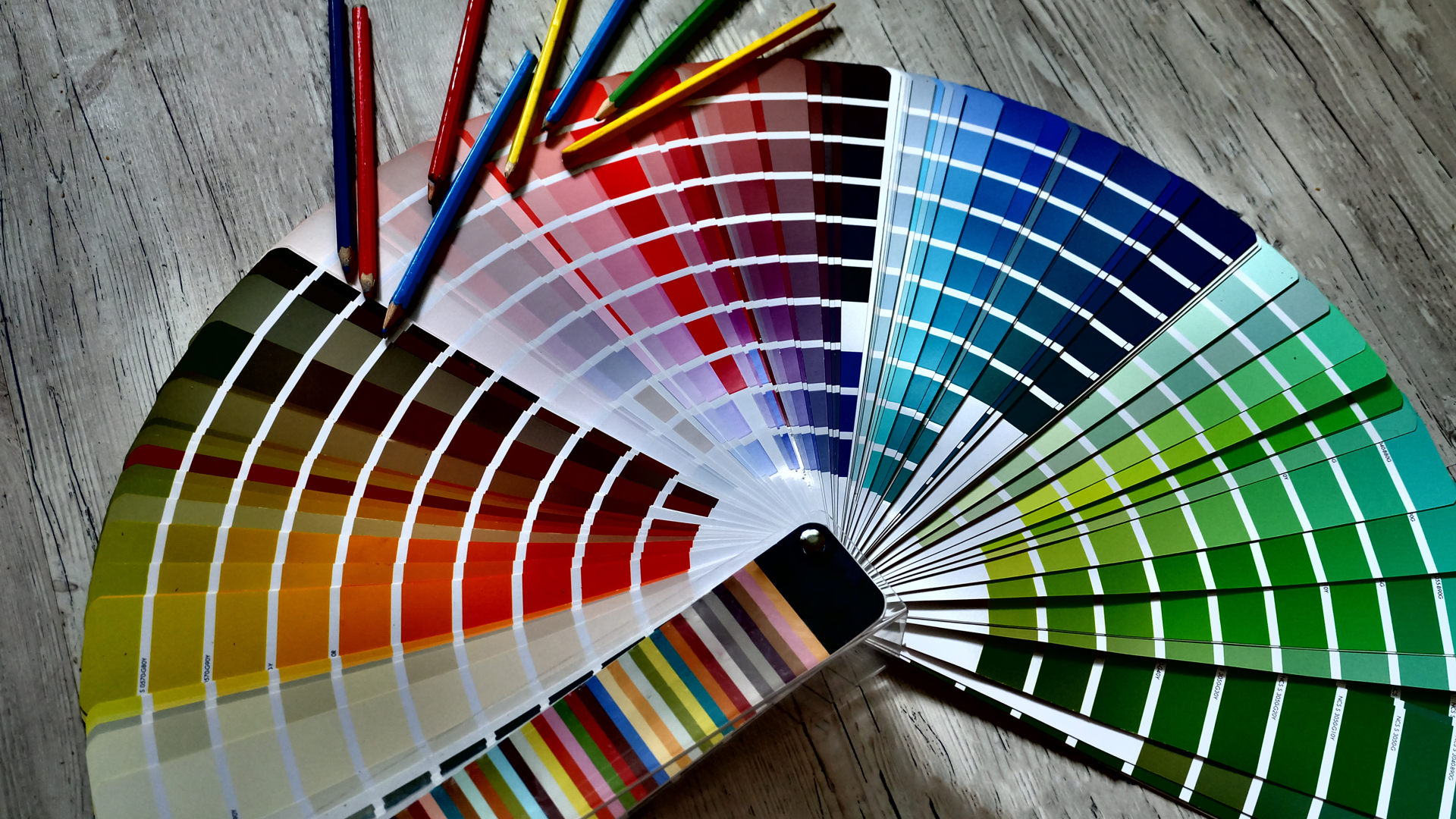 Furthermore, colour saturation levels can also affect emotion. Highly saturated colours are more intense and evoke strong reactions, whereas desaturated or pastel shades give off a more subdued feeling. For instance, bright red may elicit anger, while soft pink conveys romance and tenderness.
In addition to individual colour psychology, combinations of colours also play an important role in determining emotional response. Complementary colours (opposite on the colour wheel) create contrast, which can be visually appealing but may cause tension or unease if used excessively. Analogous colours (next to each other on the colour wheel) provide harmony and balance, which can create a calming effect.
It is also worth noting that personal experiences and preferences also influence how individuals respond to certain colours. While there are general associations with colours, it is important to consider the target audience and their specific reactions to different colour schemes.
Understanding the psychology of colour is crucial in creating a website that looks visually appealing and effectively conveys the intended emotion or mood. By carefully selecting and combining colours, designers can create a powerful tool that engages users and enhances their overall experience on a website.
Choosing the Right Colour Scheme for Your Website: Tips and Tricks
Choosing the right colour scheme for your website can greatly impact how users perceive and engage with your site. In this section, we will discuss some tips and tricks for selecting the perfect colour scheme to enhance mood and engagement on your website.
1. Understand Colour Psychology:
Before choosing a colour scheme, research the psychology behind colours. Each colour has its meaning and can evoke different emotions in people. For example, blue conveys trust and stability, while red represents passion and energy. Understanding these associations can help you select colours that align with your brand’s message and appeal to your target audience.
2. Consider Your Brand Identity:
Your brand identity should also be reflected in your website’s colour scheme. If you already have an established brand logo or colour palette, it is best to stick with those colours for consistency across all platforms. However, if you are starting from scratch, consider what colours best represent your brand’s personality and values.

 3. Keep It Simple:
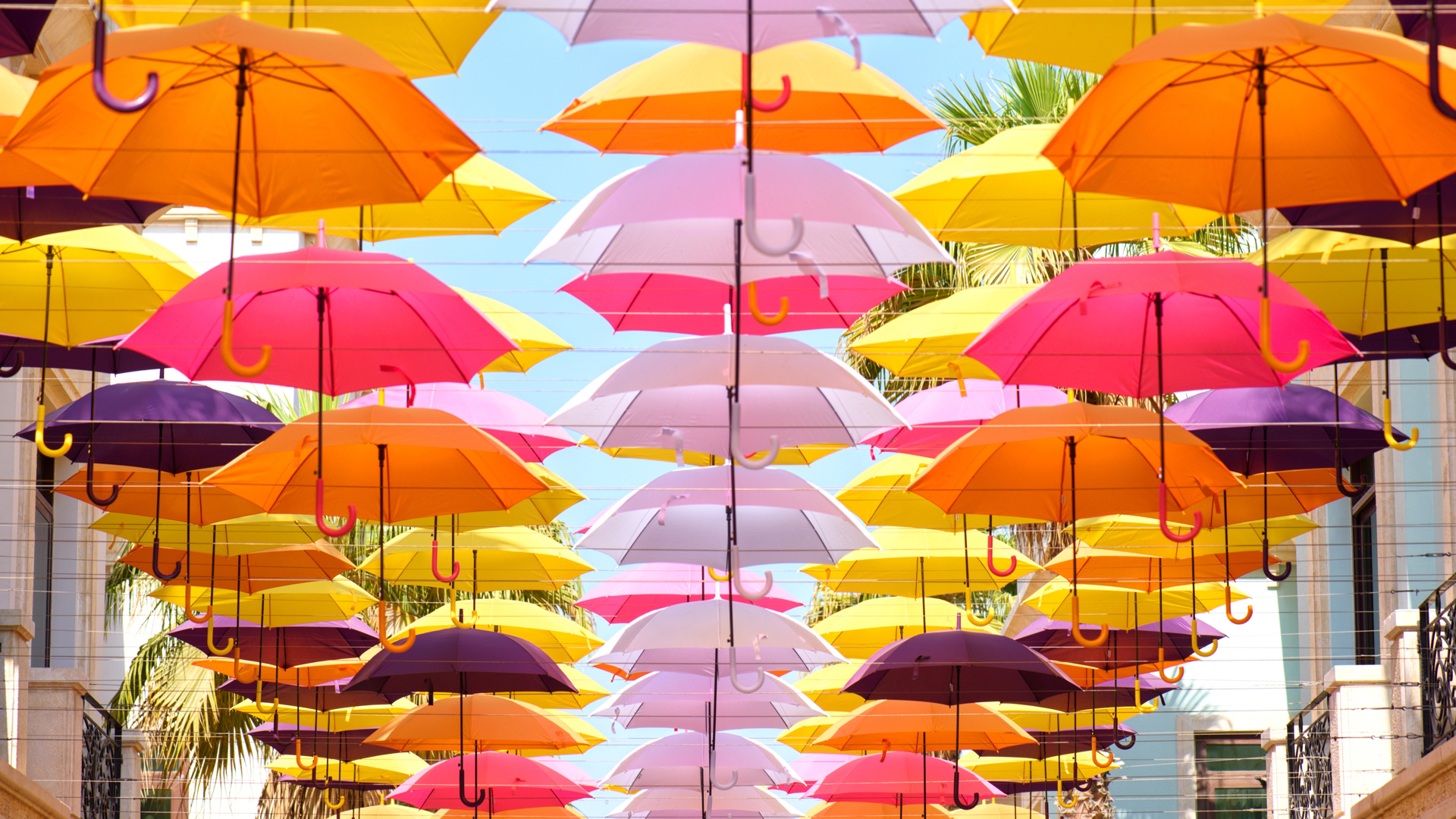
While using vibrant colours may seem appealing at first glance, having too many bright hues on your website can overwhelm users’ eyes and distract them from important content or call-to-actions (CTAs). Stick to a maximum of three primary colours in your design to create a clean and cohesive look.
4. Use Contrast Effectively:
Contrast refers to the difference between lightness or darkness of two colours used together. High contrast between text and background makes reading easier for users and adds visual interest to your design. However, ensure that there is enough contrast without creating strain on users’ eyes.
5. Set The Right Mood With Colours:
When used strategically, colours can set certain moods or emotions. For example, warm colours like red, orange, and yellow can create a sense of urgency and excitement, while cool colours like blue and green evoke calmness and trust. Consider the tone you want to convey on your website and select colours accordingly.
6. Test Your Colour Scheme:
Before finalising your colour scheme, test it on different devices and screens to ensure it looks consistent and appealing across all platforms. Also, user testing should be considered to gather feedback on how users respond to the colour scheme.
Incorporating Colour into Different Elements of Your Website Design
Incorporating colour into different elements of your website design is a part of creating a visually appealing and engaging website. Colour can evoke emotions, convey messages, and influence user behaviour. Therefore, carefully consider the use of colour in every element of your website design, including the logo, navigation bar, images, buttons, and text.
Branding: When designing a logo for your website, colour plays a significant role in creating brand recognition and conveying your brand’s message. Choose colours that align with your brand’s identity and values. For example, blue represents trust and stability, while red evokes passion and energy. Green signifies growth and nature, while yellow symbolises happiness and optimism.
Target Audience: Consider the psychological impact of colours on your target audience. For instance, if you target a younger audience, vibrant colours may more effectively capture their attention.
Navigation: The navigation bar is another important element where colour can improve user experience. Consistently using colours for links helps users easily identify clickable elements on your website. Using clear contrast between the background and font colours can help ensure readability. Additionally, using shades or hues of the same colour for different categories or sections can help organise information effectively.
 Images: Images are an integral part of any website design as they add visual interest and serve as powerful communication tools. The choice of colours in images can greatly impact how viewers perceive them. Brighter colours tend to catch attention quickly, while muted tones create a sense of calmness. Choosing complementary or analogous colours for images can create harmony within your design.
Buttons: Buttons are important in guiding users through different actions on your website, such as purchasing or signing up for a newsletter. Using contrasting colours for buttons makes them stand out from other elements on the page and encourages users to take action. It is also important to consider the button’s colour in relation to its intended function. For example, a red button may convey a sense of urgency, while a green button may signify success or confirmation.
Text: Using high-contrast colours between the background and text helps users easily read and understand the content on your website. Furthermore, using consistent colours for headings, subheadings, and body text can help create a cohesive and organised design.
Incorporating colour into different website design elements requires careful consideration to achieve maximum impact. By understanding the psychology behind colour choices and using them strategically in different elements, you can create a website that looks visually appealing and boosts mood and engagement among your audience.
Further Reading
Why you should take your design leads from big brands
Are your branding colours delivering the right message?
Need help turning this advice into action?
If you are reviewing your website, marketing or online visibility, we can help you work out what to improve first.
Related articles
 Content
Why the Same Message Needs to Be Told in Different Ways
There is a quiet myth in business that repeating yourself looks unprofessional. We explore why the same message needs to be told in different…
Read article
Content
Why the Same Message Needs to Be Told in Different Ways
There is a quiet myth in business that repeating yourself looks unprofessional. We explore why the same message needs to be told in different…
Read article
 SEO
How to Get Your Website to the Front of the Crowd
Creating a website today without SEO, social media, or any marketing at all is a bit like standing at the back of the O2…
Read article
SEO
How to Get Your Website to the Front of the Crowd
Creating a website today without SEO, social media, or any marketing at all is a bit like standing at the back of the O2…
Read article
 SEO
Designing a Website with SEO in Mind
Designing a Website with SEO in Mind walks you through the steps you need to creae a website that serves people and search engines…
Read article
SEO
Designing a Website with SEO in Mind
Designing a Website with SEO in Mind walks you through the steps you need to creae a website that serves people and search engines…
Read article
 VideoandWeb.com