
Timber Trades Benevolent Society (TTBS) Brand Identity
Case study
Timber Trades Benevolent Society
- Client
- Timber Trades Benevolent Society
- Service
- Website Design, Brand Identity, Video
- Project link
- View Website
Updating a historic charity brand for a modern audience
The Timber Trades’ Benevolent Society needed a brand identity that reflected both its heritage and its ongoing role in the timber industry. The charity has deep roots, dating back to 1897. However, the existing identity no longer provided TTBS with the clarity, flexibility, or contemporary feel it needed. The old logo placed heavy emphasis on the charity’s fundraising heritage, particularly the golf events that play such an important role in TTBS activity. Although those events remain vital to the charity, the brand needed to communicate a wider message about care, support and the people TTBS helps.
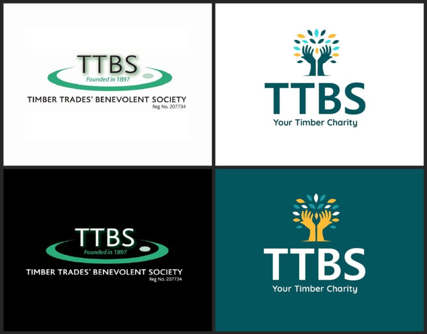
Giving the TTBS logo a contemporary facelift.
The project formed part of a wider website redesign, so the new identity had to work across digital platforms, printed materials, event graphics, donation campaigns and fundraising communications. TTBS needed more than a single logo. They needed a complete visual system that could support the charity wherever it appeared.
Leading with the name people already used
Within the timber industry, people already knew the charity as TTBS. That recognition gave us a strong starting point.
The full name, Timber Trades’ Benevolent Society, carries important historical meaning, but it also feels formal and quite long for modern digital use. We chose to lead with the initials because they created a shorter, stronger and more memorable identity. The full name still had a place within the wider brand story, but the logo needed to work quickly on screens, banners, social media, event materials and mobile devices.
We also introduced the strapline Your Timber Charity. The previous line, Founded in 1897, highlighted the charity’s history but did not explain what TTBS actually does. The new strapline speaks directly to the timber industry and makes the charity’s role much clearer. It positions TTBS as a charity that belongs to the sector and supports people within that same community.
Creating a logo device based on care and timber
The logo needed to bring together two key ideas: the timber industry and care. Rather than relying on a literal tree, timber yard, or golf-related symbol, we created a device that combined hands, leaves, and growth. The hands suggest care, support, and practical help, while the leaves connect the identity back to timber in a softer, more human way.
That balance mattered. TTBS needed a logo that felt warm and charitable, yet also relevant to an industry audience. The new mark gave the charity a more distinctive visual identity without losing sight of the sector it serves.
Designing for digital clarity
The old logo had become difficult to use in modern digital settings. It contained several elements, fine details and wording that did not always reproduce clearly at smaller sizes.
We used a stronger logo font to help TTBS stand out more effectively on websites, mobile screens, social media, videos and event materials. The updated typography gave the identity more confidence and improved legibility across different applications.
The initials sit clearly beneath the logo device, creating a compact and flexible identity that works well at both large and small sizes. That made the brand much easier to apply consistently across the website, animated video, banners, QR donation materials and printed collateral.
Building a flexible visual system
TTBS needed a broad set of brand assets to support a wide range of uses. The charity attends fundraising events, promotes golf days, communicates with patrons, shares news online and encourages donations through digital and printed materials.
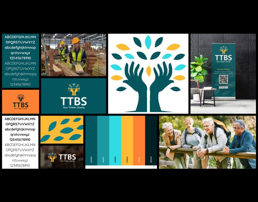
A flexible brand identity designed to work across a wide variety of media.
We created a wider visual system that included logo variations, colour palettes, typography, background patterns, leaf graphics and supporting imagery. These elements gave the charity a consistent look while allowing enough flexibility for different types of communication.
The teal, yellow, orange, aqua, and deep green colour palette gave TTBS a warmer, more distinctive presence. The colours helped the charity feel approachable, positive and contemporary, while still retaining enough depth and professionalism for industry and corporate audiences.
The leaf-based wallpapers and background graphics helped unify the identity across the website and promotional materials. They added visual character without overwhelming the message, giving TTBS a recognisable style that could support content, events and fundraising campaigns.
Supporting events, fundraising and promotion
The brand update also gave TTBS a much stronger foundation for event materials. The charity’s golf events remain some of its most important fundraising activities, so the new identity needed to work confidently in those settings. The refreshed logo, colours and supporting graphics helped TTBS look more professional at golf days, dinners and timber industry gatherings.
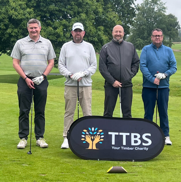
The charity’s golf events remain some of its most important fundraising activities.
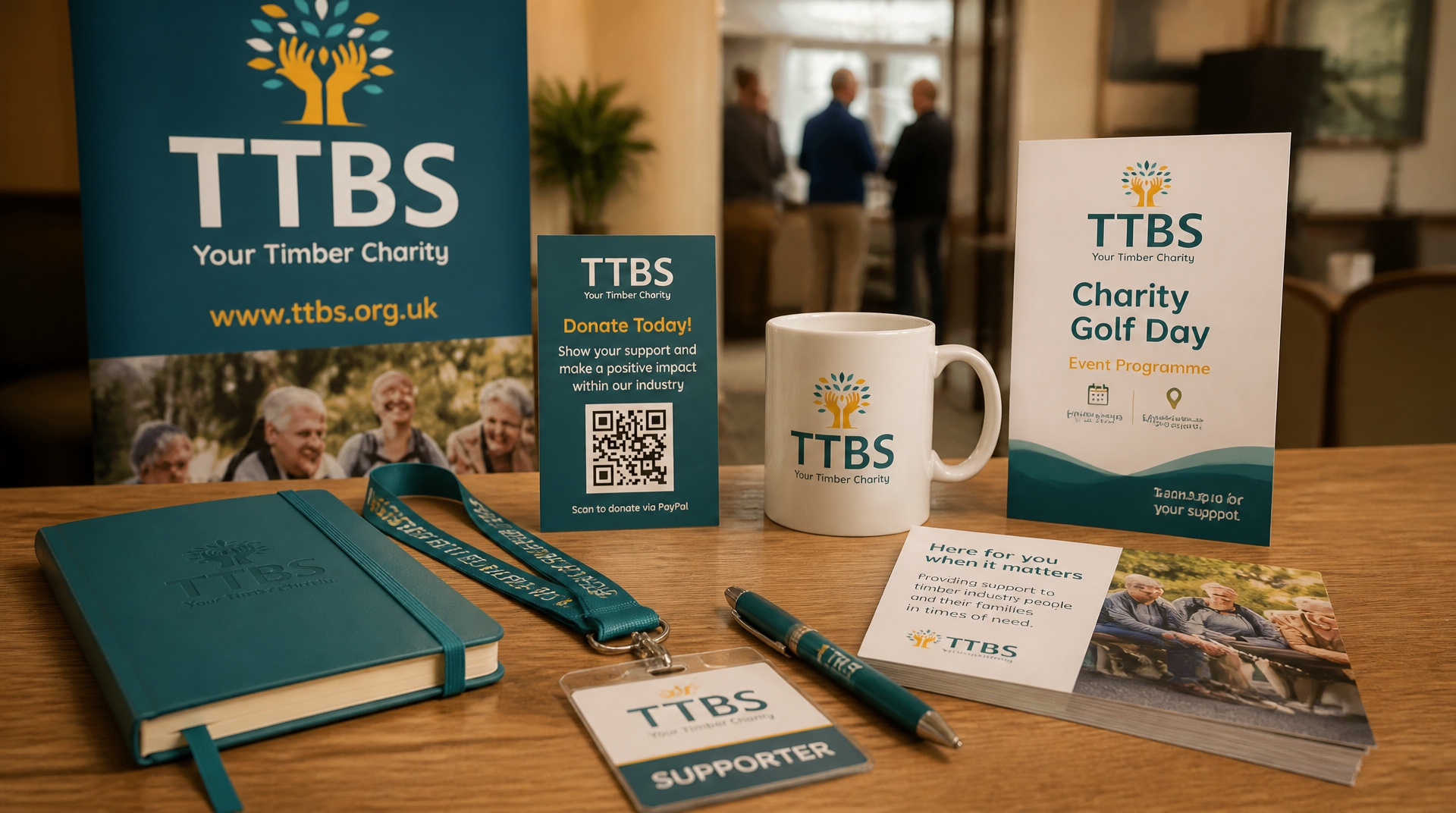
The new identity also worked well across pop-up banners, donation graphics, QR code materials, and promotional displays. These materials helped TTBS explain its purpose more clearly, encourage online donations and present a more consistent image to supporters, patrons and event attendees.
The result
The updated TTBS brand identity gave the charity a clearer, warmer and more contemporary presence.
The new logo moved the charity away from a dated, event-led identity and created a more flexible brand that could represent the full scope of its work. By leading with the initials TTBS and adding the strapline Your Timber Charity, the identity became easier to recognise, easier to understand and more closely aligned with the audience it serves.
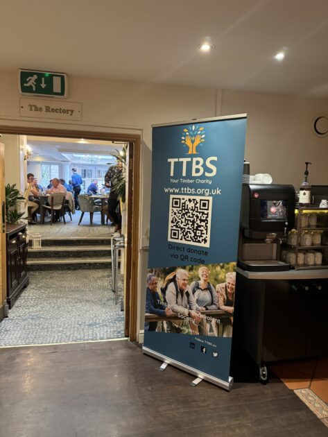
Brand flexibility for a growing charity.
The wider visual system gave TTBS the tools to communicate consistently across its website, animated video, fundraising campaigns, event materials and printed communications. The brand now feels more confident, more relevant and better equipped to support the charity’s work within the timber industry.
Project images
Client testimonial
Very happy clients
Emma has created a contemporary website and animated promotional video, which we're absolutely delighted with.
The brief we suggested was re-imagined and developed as we worked through the process together. It consequently delivered an outcome that exceeded expectations and hit the budget precisely....very happy clients.
 VideoandWeb.com