
Hedingham Contracts Brand Identity
Case study
Hedingham Contracts
- Client
- Hedingham Contracts
- Service
- Brand Identity, Vehicle Graphics
- Project link
- Visit Website
Creating a more corporate identity for a commercial contractor
When Hedingham first approached Video & Web, they already worked with commercial clients, but their existing name and brand no longer reflected the business they had become.
The company still traded as Hedingham Builders, which created the impression of a traditional local building firm. In reality, Hedingham focused on commercial maintenance, specialist property services and work for larger organisations.
They needed a brand identity that felt more professional, more corporate and more appropriate for the commercial clients they wanted to attract.
Moving away from obvious construction imagery
A key part of the brief was to avoid the visual clichés often associated with building and maintenance companies.
We deliberately avoided rooftops, ladders, tools, house outlines and other heavily figurative imagery. Hedingham did not want a logo that tied the business too closely to domestic building work or made the brand feel limited.
Instead, we created a clean, confident identity that could sit comfortably in front of commercial clients and grow with the business.
Developing a distinctive logo
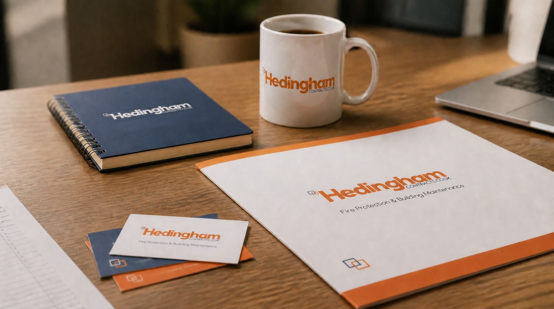
The Hedingham name gave us the strongest starting point, so we designed the logo around the word itself.
Rather than relying on an illustrative symbol, we adapted the typeface to give the lettering more individuality and presence. This helped the logo stand out while keeping the overall look professional and simple.
We added the supporting square mark as a subtle graphic device rather than a literal illustration. It gave the identity a recognisable visual element that could work across stationery, digital design, signage and vehicle graphics.
Creating the Hedingham orange
As part of the new identity, we developed a distinctive orange for the brand.
We wanted to give Hedingham a strong, memorable colour that would stand out in a commercial maintenance market where many brands feel quite conservative or generic. The orange gave the identity energy, confidence and visibility, while deeper blue, grey and white kept the brand grounded and professional.
This colour became an important part of the Hedingham brand system. It worked across the logo, supporting graphics, marketing materials and, later, vehicle livery, helping the business build a more recognisable presence.
Extending the brand onto vehicles
The vehicle design came later, once the identity had already taken shape.
We needed to make Hedingham’s vans highly visible without making them look cluttered or overly busy. We used the brand colours, logo and square graphic device to create a bold vehicle livery that made the vans recognisable on the road while still communicating the company’s commercial focus.
The finished vehicle graphics turned the fleet into a moving brand presence, supporting visibility and reinforcing the new identity wherever the business operated.
The result
The new brand identity moved Hedingham away from the image of a local builder and positioned the business as a more credible commercial contractor.
By avoiding obvious construction imagery and focusing on strong typography, colour and a flexible graphic device, we created a cleaner, more professional brand better suited to the clients Hedingham wanted to attract.
The identity gave the business a stronger foundation for future growth, supporting the website, marketing materials, vehicle graphics and wider digital presence that followed.
 VideoandWeb.com